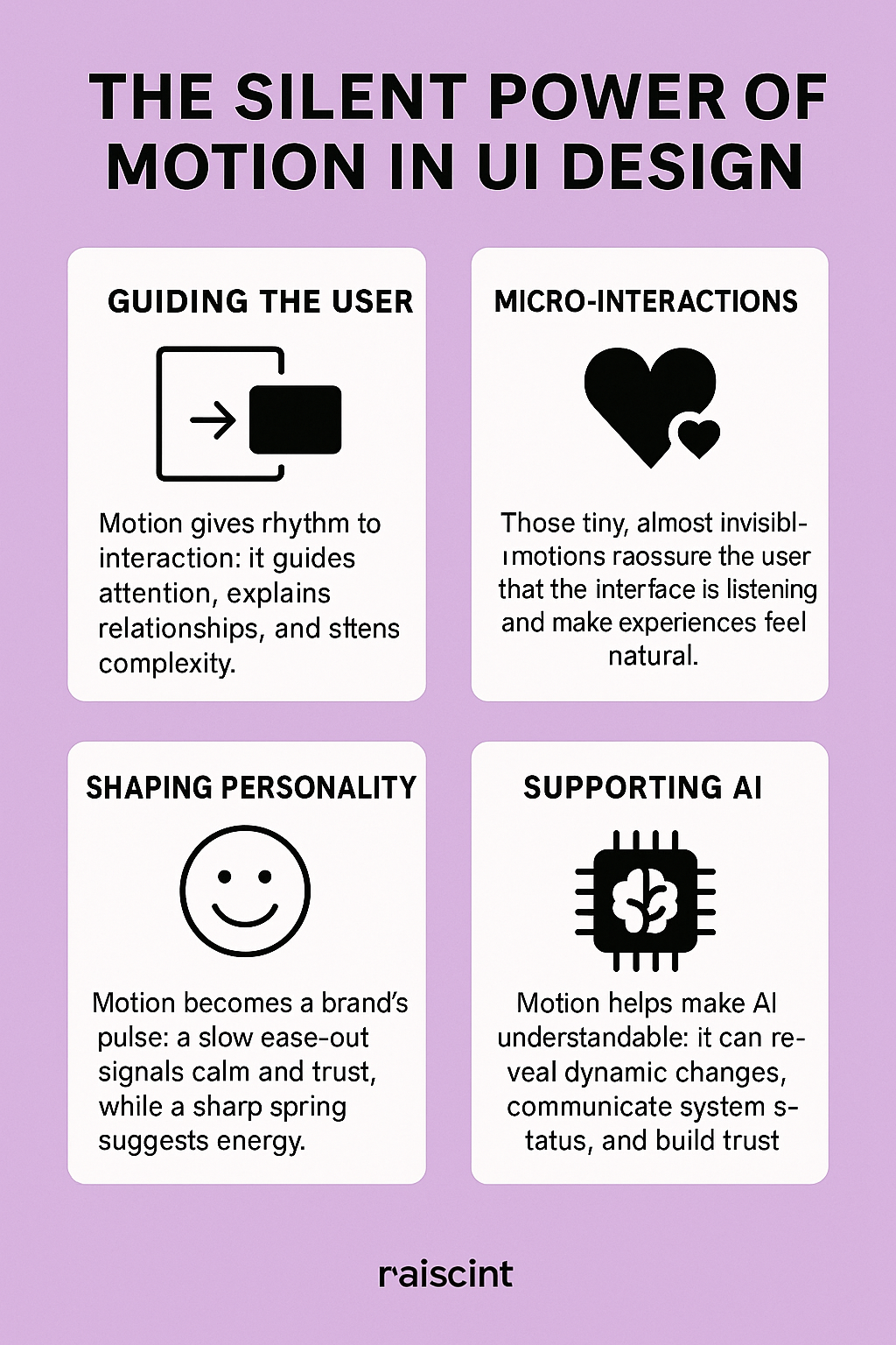
Motion in UI design is often described as an embellishment, a cosmetic flourish added near the end of a project. But if you look closely — if you trace the way people actually feel their way through digital spaces — you’ll notice something deeper: motion is the moment the interface begins to breathe. It’s the threshold where functionality crosses into psychology, where an interaction stops being a machine response and starts becoming an experience.
A card that expands like it has intention, a button that responds as if acknowledging you, a loading state that unfolds with gentle reassurance rather than impatience — these gestures create a kind of emotional choreography. They whisper context before words appear, ease cognitive friction, and quietly tune the entire atmosphere of a product.
In a world where screens saturate nearly every moment of our lives, the way those screens move matters. Motion shapes our perception of trust, clarity, personality, and pace. At its best, it becomes a silent form of storytelling.
AI has only amplified this shift. As interfaces adapt, predict, and personalize more fluidly, motion becomes the connective tissue that helps the user understand what the system is doing and why. Motion is no longer decoration — it's narrative, structure, empathy, and identity.
This article takes a deeper look into why motion in UI design has become one of the most powerful instruments of emotional resonance, behavioural clarity, and brand expression. And why, in an era shaped by AI, motion will define the emotional intelligence of the products we use.
1. Motion as Meaning: The Cognitive Psychology Behind Movement
In cognitive psychology, our brains are wired for change. Motion acts like a spotlight — it captures attention, directs focus, and helps the mind build relationships between elements. This instinctive response is why motion in UI can communicate complex information almost instantly.
A fade-in reveals hierarchy.
A slide indicates spatial connection.
A spring animation signals energy or playfulness.
A slow ease-out communicates calmness and intention.
These aren’t aesthetic choices. They’re psychological cues.
This aligns with the foundational principles discussed in Google's Motion Design guidelines:
https://material.io/design/motion
Motion guides the user not by telling them what to do, but by subtly showing them how things relate. It helps the mind understand:
-
What changed
-
Why it changed
-
What might happen next
Every well-crafted transition reduces cognitive load, allowing the user to process flow rather than fight through it. Motion becomes the difference between using a product and moving through it.
2. Micro-Interactions: The Smallest Motions with the Biggest Emotional Impact
Micro-interactions are the tiny animations that respond to user behavior — the sparkles in the interface. They are the soft nods of acknowledgment that say: I hear you. I’m responding. You’re not alone in this interaction.
Examples include:
-
A heart icon that gently expands when tapped
-
A toggle switch that snaps satisfyingly into place
-
A loading dot that pulses rhythmically like a heartbeat
When Dan Saffer introduced the concept of micro-interactions, he emphasized their emotional intelligence — their ability to make digital products feel more human.
His work remains a cornerstone: https://microinteractions.com
Micro-interactions transform routine behavior into small rituals of delight. And rituals have power. They create emotional connection.
Why does this matter? Because emotion shapes memory. People may not recall the exact typography of an app, but they remember how it felt to use it. Motion is the bridge between behavior and emotion — the place where design whispers rather than shouts.
3. Motion as a Brand Signature — The Pulse of a Product’s Personality
Brands have long used typography, color, and tone of voice to express identity. But today, motion is joining that list as a primary, not secondary, brand asset.
Imagine:
-
The warmth of a slowly expanding modal
-
The confidence of a precise snap animation
-
The playfulness of a bouncing button
-
The serenity of a floating fade transition
These are not merely interactions. They are emotional fingerprints.
Motion defines:
-
Tempo
-
Attitude
-
Energy
-
Character
A brand that wants to feel calm might use long easing curves and softened transitions.
A tech-forward product might employ crisp, precise motions with minimal latency.
A playful app might use elastic or springy animations to evoke spontaneity.
Motion becomes a form of visual personality — a living, breathing extension of the brand.
For designers exploring motion as a brand tool, animated examples on LottieFiles provide invaluable inspiration:
https://lottiefiles.com
4. Emotion in Design: Why Motion Matters on a Human Level
Designers often talk about emotion in design — warmth, clarity, delight, trust. But emotion doesn’t appear magically. It emerges from the subtleties of interaction.
Motion shapes emotional tone through:
Timing
Short, sharp motions feel energetic. Slow, weighted motions feel calm.
Easing
Ease-in creates anticipation; ease-out offers softness; spring curves add play.
Weight
Objects that move with gravity feel physical and realistic, grounding the experience.
Responsiveness
Immediate micro-motions establish confidence and reduce uncertainty.
Motion influences emotion the same way tone influences conversation. It can soothe, excite, reassure, or even frustrate. It is one of the most emotionally expressive tools in the UX/UI toolkit — and often the least understood.
Good motion design makes people feel seen.
Bad motion design makes them seasick.
The difference is empathy.
5. Motion + AI: The Future of Interfaces That Adapt and Respond
As AI becomes deeply embedded into products, UI motion becomes the guide that helps users make sense of intelligence that is otherwise invisible.
AI introduces:
-
Predictions
-
Adaptations
-
Dynamic personalization
-
Background system processes
-
Automated decisions
But how do you communicate these invisible changes without overwhelming the user?
Motion.
Motion becomes the narrator of AI behavior:
-
A shimmer across a field that the system auto-filled
-
A soft pulse indicating that the AI is thinking
-
A transition that reveals how content reorganizes based on learning
-
An animated highlight that shows why a recommendation appears
Without motion, AI feels arbitrary and confusing.
With motion, AI becomes legible and trustworthy.
The challenge of the next decade will not only be designing interfaces that are intelligent — but interfaces that feelintelligent, intuitive, and emotionally respectful.
Motion is how we give intelligence a human heartbeat.
6. Motion as Accessibility — The Often Overlooked Dimension
Motion can be:
-
helpful
-
supportive
-
overwhelming
-
disorienting
Thoughtful motion acknowledges diverse neurological responses. WCAG guidelines encourage reducing unnecessary motion, offering “reduce motion” settings, and designing animations that serve meaning rather than spectacle.
Accessible motion design includes:
-
Avoiding sudden large-scale movement
-
Using reduced-motion alternatives
-
Ensuring animations aren’t required for understanding
-
Favoring subtle transitions over dramatic shifts
Empathy is the center of emotional design, and accessibility is empathy in practice.
7. The Craft: How Designers Shape Motion With Intention
Motion design in UI isn’t improvisation. It’s choreography.
Key principles include:
Hierarchy
Primary actions carry the most prominent motion; secondary actions stay subtle.
Timing
100–300ms is often the sweet spot for natural, intuitive movement.
Easing
Linear is rarely human; curves mimic physical reality and emotional tone.
Continuity
Elements should move in ways that reflect their structural relationships.
Restraint
The best motion is the motion you barely notice.
The goal is not to entertain the user but to escort them — gently, predictably, beautifully — through an experience.
8. Tools and Techniques — Where Motion Comes to Life
Modern motion work blends design craft and engineering collaboration. Designers use:
-
Figma Smart Animate for prototypes
-
Rive for responsive, lightweight in-app animations
-
Adobe After Effects for expressive motion studies
-
Lottie for exporting animations into production
AI tools are expanding this landscape by:
-
suggesting easing curves
-
auto-generating transitions
-
optimizing performance
-
analyzing user behavior to propose motion improvements
AI becomes a collaborator, not a replacement — a partner in refining emotional nuance.
9. Conclusion: Motion as the Soul of Digital Experience
Motion is not an accessory to UI design.
It is the soul.
It shapes understanding.
It expresses personality.
It humanizes technology.
It guides the user through noise into clarity.
It transforms interaction into experience.
As AI systems grow more dynamic and interfaces become more fluid, motion will be the primary layer through which humans feel the intelligence of the products they use.
The future of design isn’t static.
It breathes.
And motion is the way we listen to that breath.


