Most digital products don’t fail because they are unusable.
They fail because they feel indifferent.
Not broken. Not confusing. Just emotionally flat.
Micro-interactions live in this subtle territory — the space between action and response, intention and confirmation. They are the smallest expressive units of an interface, yet they shape how safe, calm, and understood a product feels.
Users may never name them.
But they feel them immediately.
What micro-interactions really are
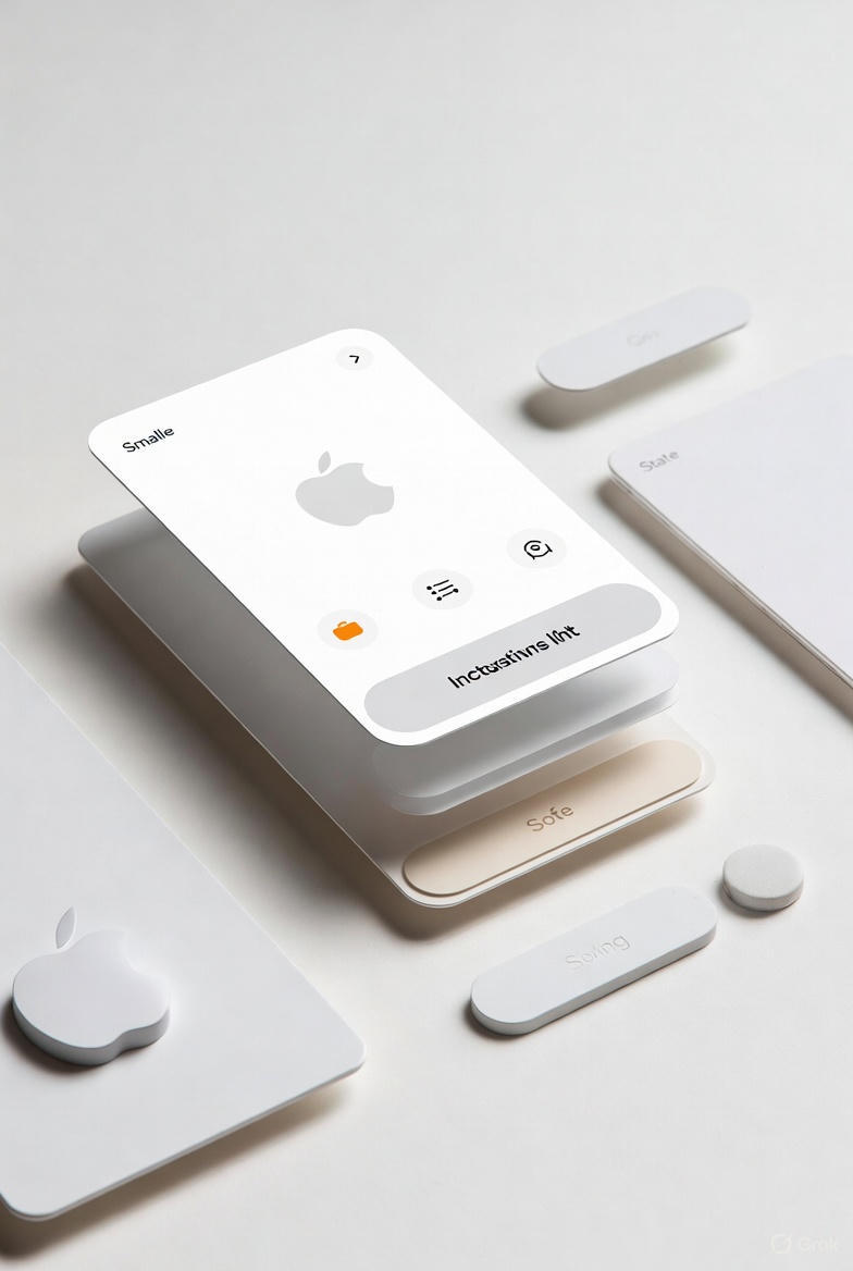
A micro-interaction is a focused moment where the system responds to a user’s action or a change in state.
A button reacts to a tap.
A form field acknowledges input.
A loading state reassures you that something is happening.
An error gently explains what went wrong.
These moments are not visual embellishments. They are behavioral signals.
At their core, micro-interactions exist to answer one question:
“What just happened — and what happens next?”
When that answer is clear, users relax. When it isn’t, tension appears.
This is why micro-interactions are inseparable from motion logic. Movement is not decoration here — it is syntax.
Why small moments carry emotional weight
Human perception is predictive. We constantly anticipate outcomes.
When we tap a button, we expect a response.
When we submit a form, we expect acknowledgment.
When nothing happens, uncertainty fills the gap.
Micro-interactions close this gap.
They reduce cognitive effort, reinforce control, and quietly build trust. Even the simplest feedback — a subtle scale change, a color shift, a micro-delay — tells the nervous system: you’re on the right path.
This emotional reassurance is especially important in dense interfaces, where clarity and information hierarchy already demand mental energy. Micro-interactions act as relief valves, preventing overload before it appears.
The anatomy of a meaningful micro-interaction
Every effective micro-interaction is built from the same underlying structure:
A trigger initiates it.
Rules define what happens.
Feedback communicates the result.
Loops and states determine how it behaves over time.
What gives these parts emotional quality is not complexity — but coherence.
When timing, motion, and visual response follow consistent rules, users don’t have to re-learn the interface. The system begins to feel predictable in the best possible way.
This predictability is where comfort emerges.
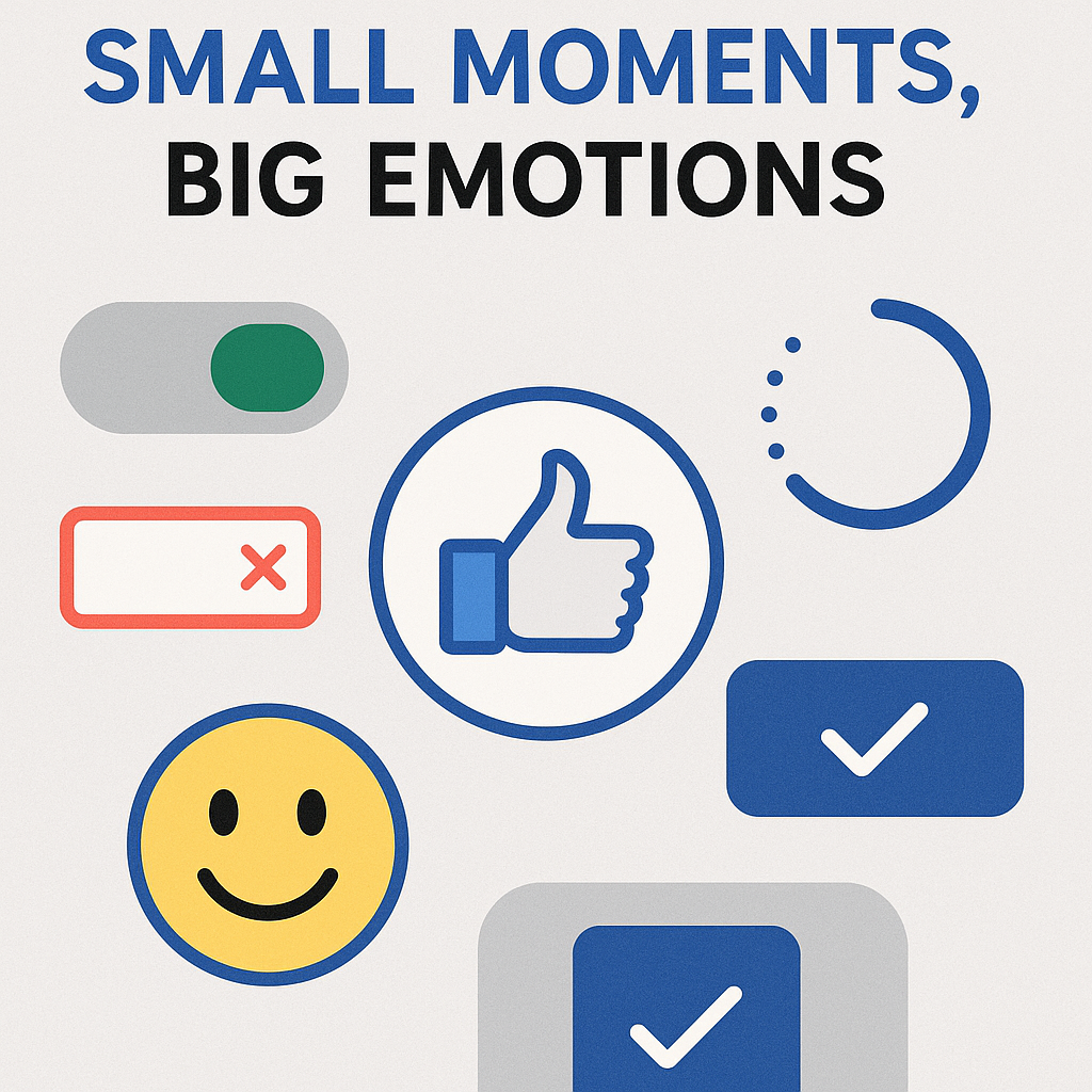
Feedback: the emotional foundation
Feedback is the most essential form of micro-interaction.
It tells users:
-
their action was registered
-
the system is responding
-
the interface is alive
Without feedback, even simple tasks feel risky.
Good feedback is immediate, proportional, and calm. It doesn’t over-celebrate. It doesn’t panic. It simply confirms reality.
Here, motion plays a crucial role — not loud motion, but restrained, intentional movement that follows a consistent motion grammar. A button press that slightly compresses communicates far more than an animated flourish ever could.
Affordance: showing possibility without instruction
Some micro-interactions exist before any action happens.
Hover states, focus rings, subtle shifts in elevation — these cues tell users what can be touched, what is interactive, what is safe to explore.
They reduce the need for explanation by letting motion and form suggest behavior.
When affordances are consistent, users stop hesitating.
When they are missing or inconsistent, users second-guess themselves.
This quiet guidance is one of the most humane aspects of interface design — and one of the easiest to overlook.
Waiting, progress, and the psychology of time
Waiting is never neutral.
A blank screen creates anxiety.
An unexplained delay creates doubt.
Progress micro-interactions exist to manage perception, not just time. A spinner, progress bar, or staged loading sequence reassures users that the system is working on their behalf.
When motion here feels rushed or chaotic, waiting feels longer.
When motion is calm and rhythmic, patience increases.
This is where interfaces begin to breathe — using pauses, transitions, and subtle rhythm to regulate emotional tempo.
Errors as moments of empathy
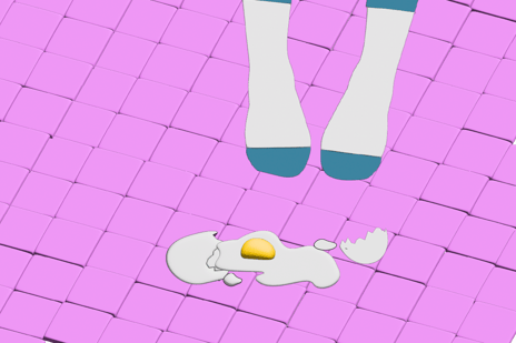
Errors are emotionally charged by default.
The role of a micro-interaction during an error is not to scold — it is to stabilize.
Gentle motion, softened timing, and clear visual hierarchy can transform a frustrating moment into a manageable one. The difference is not in messaging alone, but in how the system behaves.
A harsh shake feels accusatory.
A slow, grounded transition feels supportive.
This is where micro-interactions quietly express empathy.
Completion and closure
Every task needs an ending.
Confirmation micro-interactions — checkmarks, subtle animations, quiet visual resolution — give users a sense of closure. Without them, tasks feel unfinished, even when they technically aren’t.
These moments are small, but they shape satisfaction.
They are the punctuation marks of interface storytelling — and when repeated across a product, they form emotional consistency.
Micro-interactions, motion, and silence
Not every moment needs animation.
Stillness is part of the system.
When motion is overused, it loses meaning. When used sparingly, it becomes a signal. This balance is what allows interfaces to feel calm rather than busy.
This idea connects deeply to motion restraint and rhythm, where absence of movement can be as expressive as movement itself.
Designing micro-interactions in the age of AI
As AI tools enter the design workflow, micro-interactions gain new importance.
Automation can generate layouts, components, even flows — but emotional nuance still depends on human judgment. AI can suggest patterns, but it cannot feel hesitation, relief, or trust.
Designers now curate, refine, and contextualize. They decide where feedback matters, where silence is better, and where motion should soften an experience.
This shift reframes the designer’s role — from maker to partner
Micro-interactions are where this partnership becomes visible.
Tools don’t create emotion — intention does
Figma, Rive, After Effects, code — these are instruments.
The emotional quality of a micro-interaction comes from decisions:
-
Should this respond instantly or gently?
-
Should this moment reassure or energize?
-
Should this be noticed — or quietly disappear?
The best micro-interactions feel obvious in hindsight. They don’t compete for attention. They support the experience and then step aside.
Small moments, lasting impressions
Users rarely talk about micro-interactions.
They talk about how a product felt:
-
calm
-
smooth
-
trustworthy
-
intuitive
Those feelings are built from dozens of tiny decisions — repeated consistently over time.
Micro-interactions are not details.
They are the emotional infrastructure of digital products.
Design them with care, and everything else becomes easier to understand — and easier to trust.


