In the language of digital experience, layout is the quiet architect. It sets the rhythm of how we read, how we scan, how we breathe inside an interface. A layout isn’t just an arrangement of blocks on a screen — it is a psychological landscape. It shapes how easily our minds can make sense of information, how much effort we spend parsing meaning, and how emotionally calm or overwhelmed we feel while doing it.
Cognitive load — the mental effort required to process information — becomes the invisible currency of interface design. Every misaligned element, every crowded cluster, every inconsistent spacing forces the brain to work harder. Good layout, on the other hand, creates mental spaciousness: your eyes glide, your thoughts settle, and the interface feels intuitive before you even understand why.
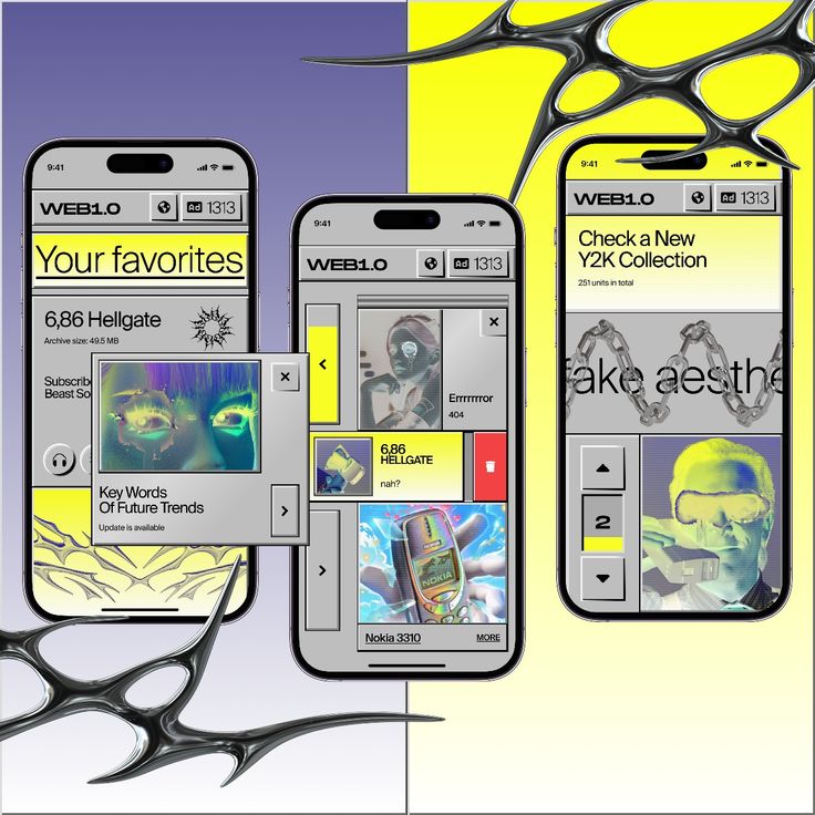
AI is accelerating the complexity of digital ecosystems, generating content dynamically, personalizing interfaces, and adapting layouts in real time. In this fluid environment, cognitive load management becomes even more essential. Layout becomes the stabilizing force — the structure that keeps intelligence legible.
And when motion joins layout with intention, the interface stops feeling like static architecture and starts functioning like a living guide, gently pointing the user toward clarity.
1. The Psychology of Layout: Why the Brain Craves Order
Humans are pattern-seeking creatures. We search for anchors, alignments, symmetry, rhythm. A well-designed layout honors these cognitive tendencies. It answers silent questions instantly:
-
Where should my eyes go first?
-
What belongs together?
-
What can I ignore for now?
-
How much effort is required to understand this?
Poor layout leaves the brain stranded in decision fatigue. Good layout reduces friction by giving structure to thought.
This is why powerful layout systems — like the classic 8-point grid or Material Design’s spacing logic — provide psychological safety:
https://m2.material.io/design/layout/spacing-methods.html
2. Reducing Cognitive Load Through Visual Hierarchy
Visual hierarchy is the map of meaning. It tells the user what is primary, what is supportive, and what can wait. Without hierarchy, every element competes for attention, amplifying cognitive noise.
Effective hierarchy uses:
Typography
Contrast between headings, subheadings, and body text communicates order.
Spacing
White space creates boundaries and reveals relationships.
Scale
Larger elements signal importance; smaller elements fade into the periphery.
Color & Tone
Color can act as a guide or, if overused, a source of overwhelm.
This aligns with cognitive load theory, which teaches us that the brain’s working memory is limited — beautifully limited — and must be protected.
A clear hierarchy becomes a form of care.
3. Layout, Emotion, and the Subtle Language of Calm
Emotion in design shapes the user’s relationship with the product. A cluttered layout evokes tension. A spacious layout evokes trust. Emotional design isn’t merely visual; it’s perceptual — it’s how the interface feels on a neurological level.
Small moments of clarity reduce stress. Predictable patterns build comfort. Smooth transitions give reassurance.
The emotional impact of layout blends three ingredients:
Predictability – reduces anxiety
Simplicity – reduces mental load
Consistency – reduces cognitive switching costs
When layout supports emotion, the interface becomes more than functional — it becomes a psychological refuge in a noisy digital world.
4. How Motion Supports Layout and Reduces Cognitive Load
Motion isn’t only about aesthetics. When used intentionally, it becomes the explainer of layout.
Examples:
-
A card expanding shows what content belongs inside it.
-
A smooth fade reveals new hierarchy without surprise.
-
A transition that shifts content gently left indicates spatial organization.
-
A subtle highlight directs the eye to what changed after a user action.
Motion helps the user understand structural relationships that would otherwise require conscious effort. It turns layout from static architecture into a dynamic storytelling tool.
When Google introduced motion guidelines, the focus wasn’t decoration — it was continuity, clarity, and meaning:https://material.io/design/motion
Motion reduces cognitive load by answering questions before the user even asks them.
5. AI and Adaptive Layouts: The Future of Cognitive Design
AI-driven systems increasingly personalize:
-
content
-
recommendations
-
information density
-
layout structure
This introduces both opportunity and risk.
Opportunity:
AI can adapt layout based on a user’s behavior, reducing cognitive load automatically. For example:
-
If a user scans quickly, AI can surface headlines more prominently.
-
If a user hesitates, AI can highlight important elements or simplify the view.
-
If a user frequently performs a task, AI can move it closer to the top of the layout.
AI becomes a partner in clarity — not just a generator of content, but a curator of cognitive ease.
Risk:
If AI rearranges elements without visual logic or without motion to guide the shift, the interface can feel unstable or unpredictable, increasing cognitive load.
This is where motion and layout work together: motion explains AI’s decisions, and layout grounds them.
To explore AI’s role in UX more broadly, Nielsen Norman Group provides a strong foundation:
https://www.nngroup.com/articles/ai-ux-design/
6. Clarity as a Brand Trait: The Aesthetics of Ease
Brands increasingly compete not only on functionality but on ease.
Ease becomes a differentiator.
Ease becomes a feeling.
Ease becomes memory.
A well-crafted layout communicates:
-
confidence
-
sophistication
-
emotional intelligence
The clearer the layout, the more competent the product feels.
This is why companies like Apple, Notion, and Linear invest deeply in spacing, balance, and calm visual systems. Their layout expresses their philosophy: precision, intention, and emotional care.
Clarity becomes a brand value.
7. Principles for Designing Low-Cognitive-Load Layouts
These principles form the backbone of cognitively supportive UI design:
1. Group related content
The mind loves clusters; they reduce scanning effort.
2. Use predictable patterns
Consistency reduces mental work across screens.
3. Limit simultaneous elements
Choice overload is cognitive overload.
4. Use motion to clarify change
Not to decorate, but to explain.
5. Maintain strong vertical rhythm
Spacing becomes invisible guidance.
6. Reveal information progressively
Show only what the user needs at the moment.
7. Let white space speak
Silence is a form of communication.
These principles turn complexity into clarity — and clarity into an emotional experience.
8. Tools for Building Better Layouts (with AI + Motion)
Modern tools help designers craft spacious, intentional layouts:
-
Figma Auto Layout for responsive structure
-
Figma Smart Animate for transition prototypes
-
Rive for dynamic motion
-
Lottie for lightweight, production-ready animations
-
AI layout assistants that propose hierarchy, spacing, and simplification
-
AI design systems that ensure consistency at scale
AI helps remove friction from layout work. Motion tools help visualize cognitive flow.
Together they shape a future where design is more adaptive, more intelligent, and more emotionally attuned.
9. Conclusion: Layout as a Portal Into Mental Ease
Layout is often underestimated because it is quiet.
But quiet things are often powerful.
A thoughtful layout is invisible in the best way — not because it doesn’t exist, but because it removes every unnecessary burden from the user’s mind. It provides structure. It offers clarity. It gives the user mental space.
When supported by meaningful motion and guided by AI, layout becomes a living system — one that adapts, responds, and cares.
Designing layout is not just arranging buttons and text.
It is designing thought.
Designing attention.
Designing emotion.
Designing ease.
The future of UI belongs to interfaces that feel light, intuitive, and alive — and layout is where that future begins.


