Design elements are often taught as ingredients.
Color. Typography. Layout. Motion. Space.
But interfaces are not recipes. They are experiences unfolding over time. And design elements are not ingredients — they are language.
They speak before users read. They persuade before users decide. They soothe or agitate, guide or overwhelm. Long before a user understands what an interface does, they feel what it is.
This post explores design elements not as isolated parts, but as an interdependent system — one that shapes clarity, emotion, and meaning across digital experiences.
Elements don’t exist alone — they form behavior
No element communicates in isolation.
Color without hierarchy becomes noise. Typography without rhythm becomes exhausting. Motion without intent becomes distraction. Space without structure becomes emptiness.
Design elements gain meaning only through relationships. They signal importance by contrast. They create calm by restraint. They guide attention by sequencing.
This is why good interfaces feel effortless. The elements collaborate quietly, shaping behavior without announcing themselves.
And this collaboration is where design moves from aesthetics into cognition.

Layout is the first narrative
Before motion moves and color speaks, layout tells the opening line of the story.
Layout answers the user’s most fundamental questions: Where am I? What matters here? What can I do next?
When layout is clear, users don’t scan — they flow. When it’s chaotic, users hesitate, reread, and second-guess.
Designing layout is essentially designing cognitive load — deciding how much the brain must work to understand what’s in front of it. This relationship is explored deeply in reducing cognitive load through layout clarity.
A well-structured layout doesn’t just organize information. It reduces anxiety.
Typography shapes emotional tempo

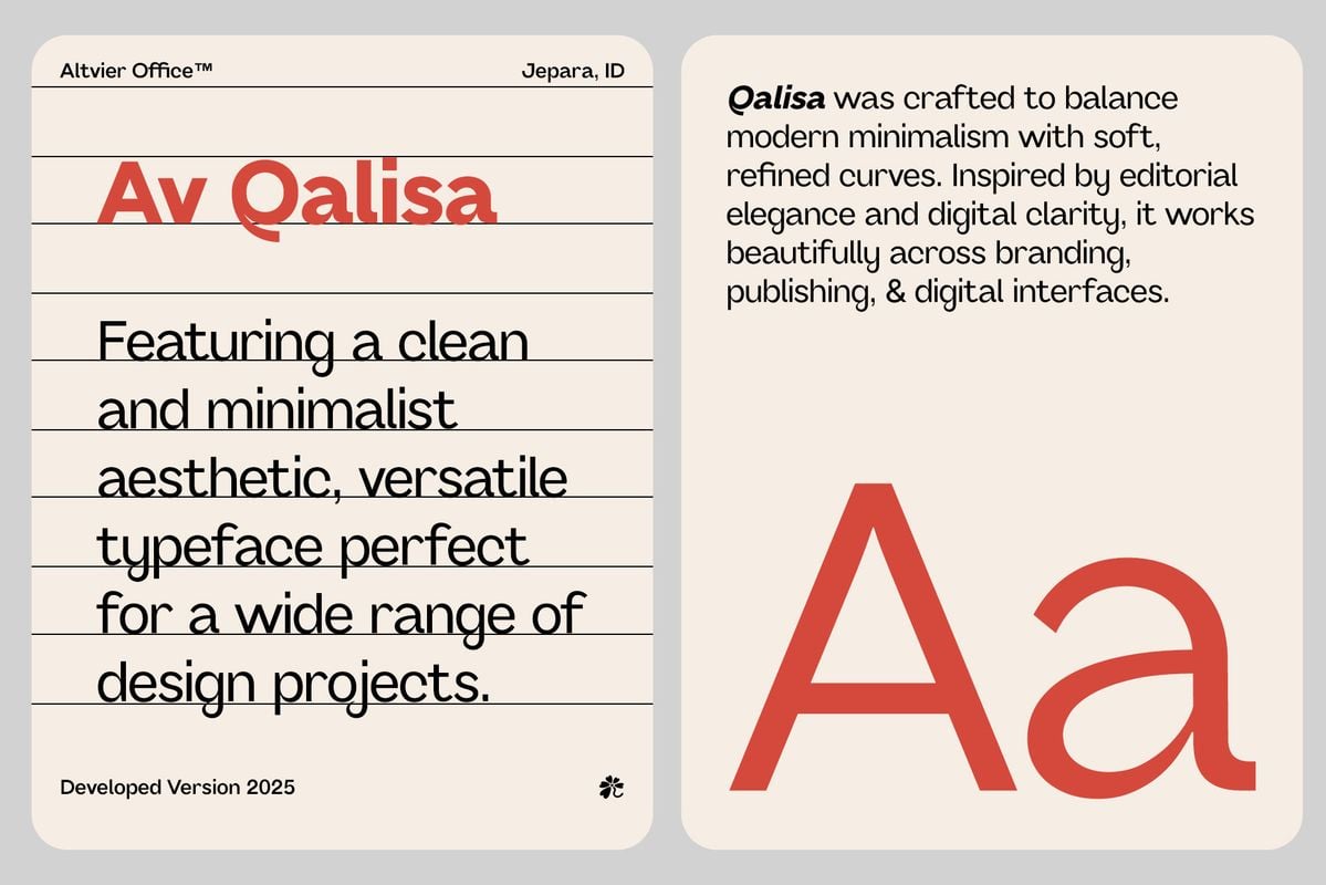
Typography is often discussed in terms of readability. But it also shapes tempo.
Line height creates breathing room. Font weight establishes urgency or calm. Typographic hierarchy creates pauses, emphasis, and flow — much like punctuation in language.
When typography is consistent, users feel grounded. When it’s erratic, users feel unsettled.
Good typography doesn’t shout. It guides.
And when paired with thoughtful spacing, it allows interfaces to breathe — not visually, but cognitively.
Space is not emptiness — it’s permission
Whitespace is often misunderstood as “unused” space.
In reality, space is what gives elements permission to exist without competition. It’s what allows the eye to rest, the mind to process, and decisions to feel deliberate rather than rushed.
Interfaces that lack space feel urgent even when they don’t need to be. Interfaces that respect space feel confident.
This sense of quiet confidence is a core ingredient of calm interface design.
Space is emotional regulation, expressed visually.
Motion turns structure into experience
If layout is structure, motion is behavior.
Motion shows relationships that static screens cannot. It explains continuity. It reinforces cause and effect. It softens change.
But motion only works when it follows rules.
When motion behaves consistently, users learn its language. When it behaves randomly, users feel manipulated or distracted. This is why motion must be treated as grammar — not ornament.
This idea is central to motion as grammar, where movement becomes a system of meaning rather than a collection of effects.
Stillness is part of motion
Designers often focus on what moves. Rarely on what doesn’t.
Stillness creates contrast. It makes motion meaningful. It signals stability and control.
Interfaces that move constantly feel nervous. Interfaces that move selectively feel intentional.
This balance between movement and rest defines interfaces that breathe. Not because they are animated, but because they respect rhythm.
Color carries emotion faster than language

Color is emotional shorthand.
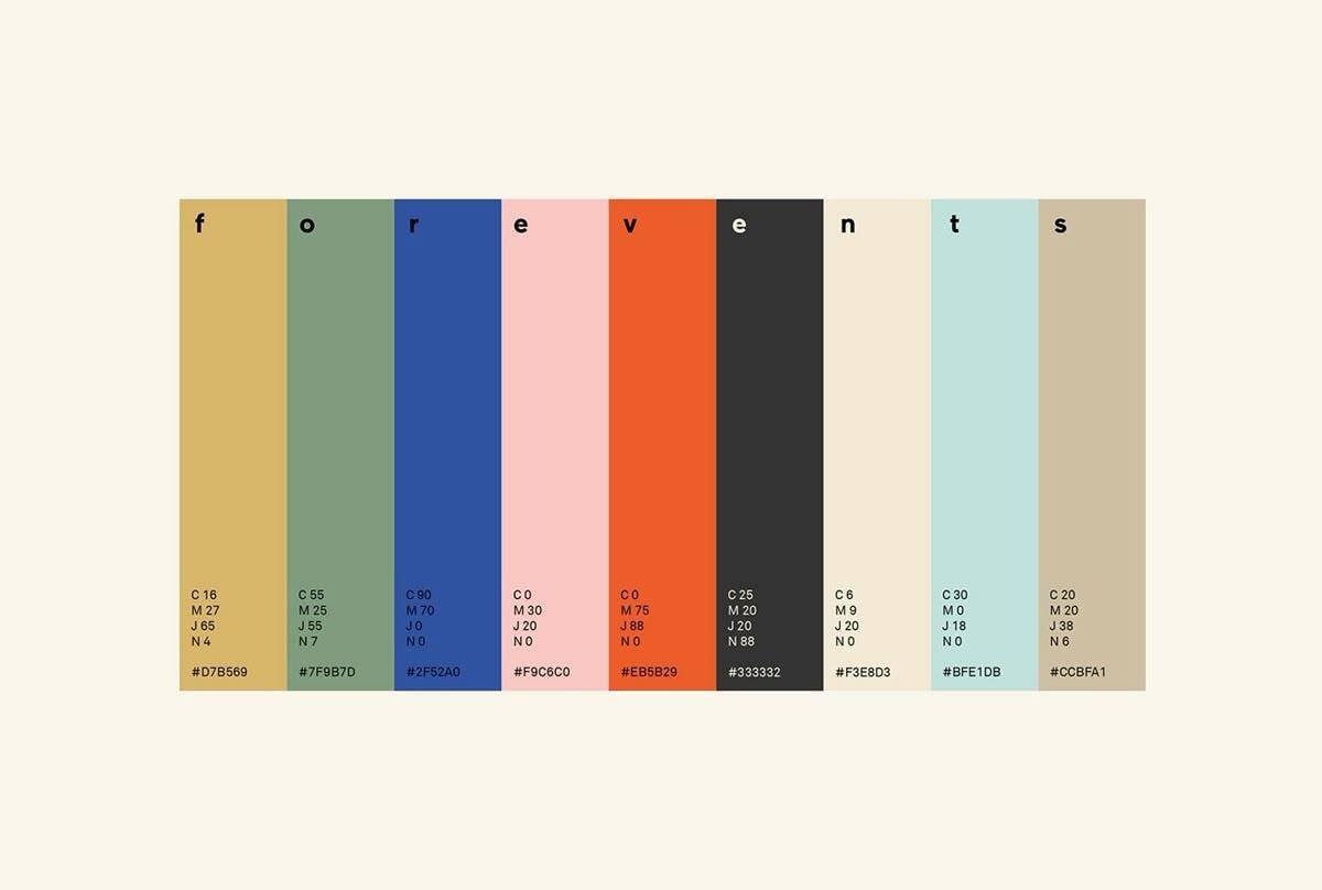
Users don’t need to be told that red is urgent or that muted tones are calm — they feel it instantly. But color’s power lies not in symbolism, but in consistency.
When color is used systematically, it builds trust. When it’s used decoratively, it confuses.
Color should reinforce hierarchy, not replace it. It should clarify states, not decorate screens. And most importantly, it should align with the emotional intent of the product.
Color is not about preference. It’s about perception.
Design elements as storytelling tools
Every interface tells a story — even if unintentionally.
Design elements determine how that story unfolds. Layout introduces context. Typography sets tone. Motion connects scenes. Color emphasizes meaning. Space creates pauses.
Together, these elements create narrative interfaces.
Narrative design doesn’t mean adding illustrations or metaphors. It means respecting sequence, progression, and resolution.
Users want to know where they are in the story — and what happens next.
Consistency builds emotional memory
Design elements repeat.
Users don’t evaluate them once — they experience them over time. Consistency allows elements to fade into muscle memory, freeing attention for actual goals.
When design elements behave predictably, users stop thinking about the interface and start thinking through it.
This is one of the most underestimated forms of trust.
AI changes execution — not responsibility
As AI tools enter the design workflow, the role of design elements becomes more critical, not less.
AI can generate layouts, color schemes, and animations in seconds. What it cannot generate is coherence — unless the designer provides it.
When AI becomes a design partner [LINK → When AI Becomes a Design Partner: Rethinking the UX Workflow], the designer’s role shifts from creator to curator, editor, and storyteller.
Design elements become the constraints that shape AI output into meaningful systems.
Design elements are ethical decisions
Every design choice influences behavior.
Dense layouts increase pressure. Aggressive motion creates urgency. Color can manipulate attention. Lack of space can rush decisions.
Design elements are not neutral.
Designing responsibly means understanding how these elements affect cognition and emotion — and choosing clarity over coercion.
This is where calm, narrative-driven interfaces are not just aesthetic preferences, but ethical stances.
Design is not about adding — it’s about aligning
Mature design rarely adds more. It aligns what already exists.
It ensures that layout, motion, color, typography, and space are telling the same story. That they support the same intention. That they respect the same cognitive and emotional boundaries.
When elements align, interfaces feel inevitable — as if they couldn’t have been designed any other way.
Final thought: design elements are not visual — they are experiential
Design elements are felt before they are understood.
They shape trust. They reduce friction. They create meaning through restraint and rhythm.
When treated as a language — not a checklist — design elements stop being visible.
And that’s when they do their best work.


