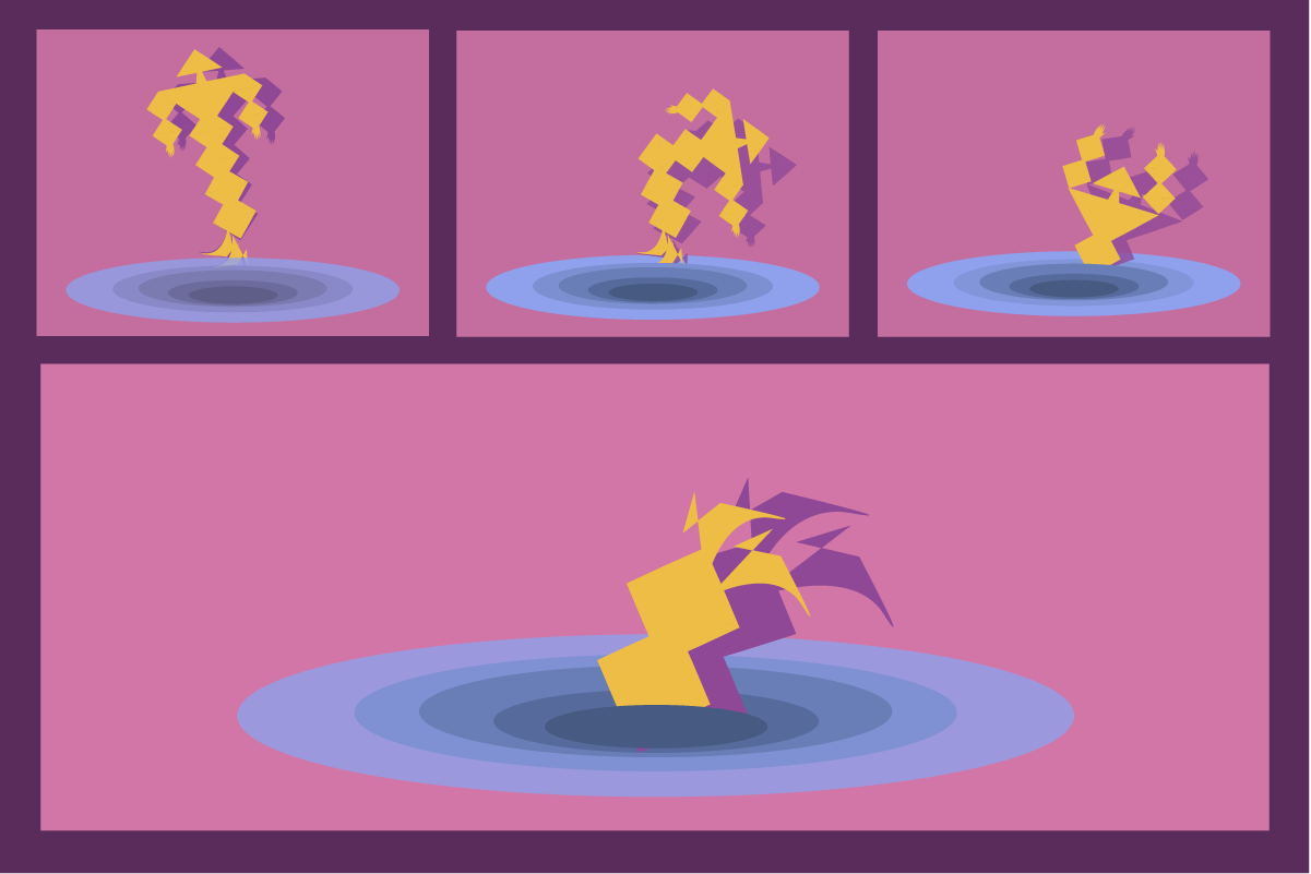
Motion in interfaces is often treated like decoration. Something to add at the end, once the layout is finished and the colors feel right. A soft transition here. A playful bounce there. Enough movement to make the interface feel “modern.”
But motion is not an accessory.
Motion is language.
It carries meaning before text is read. It sets rhythm before content is processed. It shapes emotion before logic steps in. And just like grammar in spoken or written language, motion defines how ideas connect, pause, escalate, and resolve.
When motion is designed without intention, interfaces feel noisy or childish. When motion is designed as grammar, interfaces feel coherent, calm, and alive.
This post explores motion not as animation, but as structure. Not as visual delight, but as behavioral guidance. Not as trend, but as meaning.
Why motion communicates before we understand
Human perception is temporal. We experience the world in sequences, not static frames. Our brains are exceptionally good at noticing change — acceleration, interruption, delay.
Motion speaks to this part of cognition directly.
Before we read labels or understand hierarchy, we feel timing. We sense whether something reacts immediately or hesitates. We notice whether an element enters gently or abruptly. These signals shape trust faster than any copy ever could.
Motion reduces the need for explanation because it shows relationships instead of describing them. A panel sliding from the right implies continuation. A modal scaling from the center suggests interruption. A button compressing slightly under a click confirms cause and effect.
These moments often appear as micro-interactions, but their power comes from shared rules — grammar, not isolated gestures.
Grammar, not choreography
There’s a difference between choreography and grammar.
Choreography is about spectacle. Grammar is about structure.
A single beautiful animation means nothing if it contradicts the rest of the system. Motion grammar is what allows multiple animations, across screens and states, to feel like they belong to the same language.
In interface motion, grammar defines:
-
how elements enter and exit
-
how states change
-
how attention shifts
-
how actions resolve
Without grammar, motion becomes a collection of unrelated movements. With grammar, motion becomes predictable — and predictability is what creates comfort.
Users don’t want to be surprised all the time. They want to understand.
Timing is the sentence length of motion
In written language, short sentences create urgency. Long sentences create reflection. Pauses change meaning.
Motion works the same way.
Fast motion feels reactive and mechanical. Slow motion feels intentional and human. But the goal isn’t choosing fast or slow — it’s choosing appropriate.
A tap response should be nearly instant. A screen transition can breathe. A destructive action may pause slightly, allowing the user to reconsider. Each duration communicates intention.
When timing is inconsistent, users feel it — even if they can’t articulate why.
This is where many interfaces fail. Not because their animations are bad, but because their timing lacks hierarchy. Everything moves with equal importance, which makes nothing feel important.
Motion grammar creates emphasis through contrast.
Easing is emotional tone
If timing is sentence length, easing is tone of voice.
Linear motion feels robotic. Harsh ease-in feels aggressive. Overly elastic motion feels playful — or childish — depending on context.
Easing choices subtly define personality. They tell users whether a product is calm, efficient, expressive, or serious. They also influence perceived quality. Poor easing often reads as cheap, even when visuals are refined.
This emotional layer is why motion cannot be separated from brand or product intent.
And it’s why micro-movements inside feedback interactions matter more than large transitions. Small easing choices, repeated often, define how a product feels over time.
Motion creates spatial logic
Good motion helps users understand space — even in flat interfaces.
When elements move consistently, users build a mental model of where things come from and where they go. This reduces disorientation and increases confidence.
For example, if details always expand from their parent element, users learn that relationship. If navigation always pushes content sideways, users understand directionality. When these patterns break, users feel lost.
Motion grammar supports layout clarity and cognitive load reduction by reinforcing spatial logic instead of fighting it.
This is where motion and layout stop being separate disciplines and start collaborating.
Attention is guided, not demanded
Bad motion demands attention. Good motion guides it.
Attention is a limited resource. Motion that competes with content creates fatigue. Motion that subtly redirects attention creates flow.
Think of motion as a gentle hand on the shoulder, not a shout.
This is especially important in complex interfaces where information density is high. Motion can:
-
reveal priority
-
indicate progression
-
soften transitions between mental states
When paired with strong hierarchy, motion becomes a guide rather than a distraction. When used without hierarchy, it becomes noise.
The invisible contract of cause and effect
One of motion’s most important roles is reinforcing causality.
When users act, something should respond — and the response should feel connected to the action. This connection builds trust. When it breaks, confusion follows.
This is the foundation of micro-interaction feedback loops. Buttons compress. Toggles slide. Cards lift. These motions don’t exist to entertain — they exist to confirm reality.
The tighter the cause-effect loop, the stronger the sense of control.
And control is emotional safety.
Motion and error: slowing down the moment
Errors are emotionally charged moments. Motion can either escalate tension or soften it.
A sudden shake may communicate “wrong,” but it can also feel punitive. A slow, gentle shift paired with clear messaging can feel supportive.
Grammar matters here more than style.
Errors often benefit from slight delays, reduced motion amplitude, and calmer easing. This gives users space to recover without panic. It’s a reminder that motion isn’t about energy — it’s about empathy.
These moments connect directly to the emotional role of error micro-interactions, where motion can either build or break trust.
Motion as narrative structure
Motion connects moments into stories.
Every interaction has a beginning, middle, and end. Motion defines these phases. Entry sets context. Transition builds tension. Resolution provides closure.
This is why motion is inseparable from narrative interfaces. Even the simplest flow — open, act, confirm — becomes a story when motion is intentional.
Users may never consciously notice this story, but they feel it. They feel when something resolves cleanly. They feel when something drags. They feel when something ends abruptly without closure.
Motion grammar ensures that stories feel complete.
Consistency creates emotional memory
Users don’t evaluate motion once. They experience it repeatedly.
Consistency allows motion to fade into muscle memory. When users know how things behave, they stop thinking and start flowing.
This is one of the strongest arguments against over-experimentation. Novel motion can be delightful once, but exhausting over time.
Emotion in interfaces is cumulative. Small, repeated moments shape long-term perception more than big gestures.
That’s why micro-interactions are not small at all. They are the emotional baseline of the product.
Reduced motion is not reduced meaning
Accessibility often raises concerns about motion. But reduced motion doesn’t mean removing grammar — it means translating it.
When motion is minimized, meaning can still be conveyed through opacity, scale, spacing, or timing changes. The structure remains. The language adapts.
Designing motion grammatically makes this translation easier, because you’re not relying on spectacle — you’re relying on relationships.
Inclusive motion design respects different sensitivities while preserving clarity.
Tools don’t define motion — decisions do
It’s tempting to think motion quality comes from tools: Figma, Rive, After Effects, code frameworks.
But tools only execute decisions.
The real work happens when you decide:
-
what deserves motion
-
what should remain still
-
what should be instant
-
what should linger
Stillness is part of motion grammar. Silence is part of language.
The best motion designers know when not to animate.
Motion that means something stays quiet
The most meaningful motion often goes unnoticed.
It doesn’t ask for applause. It doesn’t interrupt. It supports.
Users don’t say, “I loved the easing.”
They say, “It felt smooth.”
“It made sense.”
“I didn’t have to think.”
That’s grammar working.
Motion that means something respects cognition, emotion, and attention. It collaborates with layout, color, and content. It reinforces micro-interactions rather than competing with them.
Final thought: design motion like you design language
You wouldn’t randomize punctuation in a sentence. You wouldn’t switch tense mid-paragraph. You wouldn’t shout every word.
Motion deserves the same care.
When designed as grammar, motion becomes invisible — and powerful. It carries meaning quietly, shaping experiences that feel intentional, human, and trustworthy.
Design movement not to impress.
Design movement to communicate.


